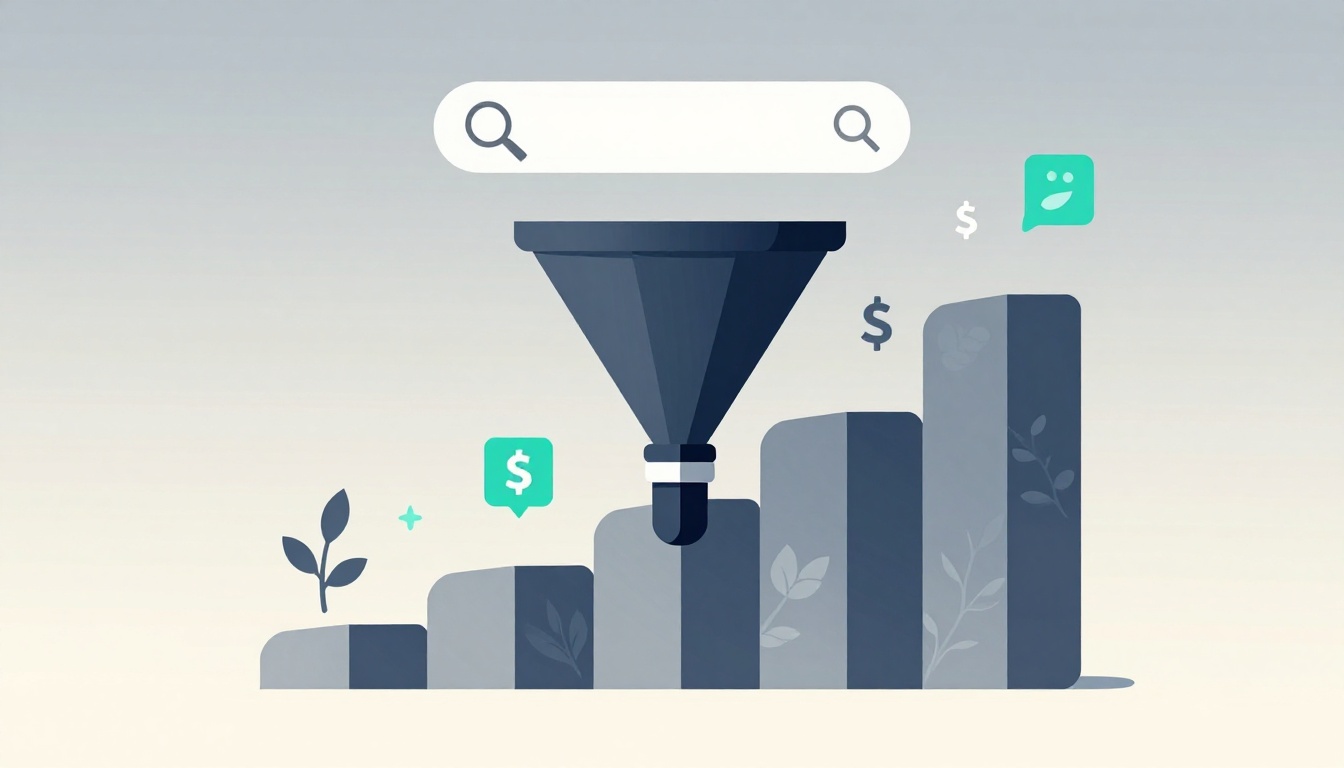
Most service pages lose leads before the visitor reaches the middle of the page. The problem usually is not traffic, and it is not design alone. It is the service page structure. When you organize your content effectively, you create a seamless path for visitors, which is essential for effective lead generation.
A high-converting service page guides people from problem to proof to action with as little friction as possible. That structure helps SEO because the topic is clear, and it helps conversions because the next step is obvious.
If your page gets visits but not inquiries, the order of your sections is often the first thing to fix.
Key Takeaways
- Structure drives conversions: A high-converting service page must guide visitors through a logical sequence—problem, solution, proof, and a clear call to action—rather than relying on design alone.
- Prioritize clarity over complexity: Every service should have its own dedicated page to maintain a singular focus and align perfectly with specific search intent, rather than crowding one page with multiple offerings.
- Build trust with specific evidence: Move beyond generic claims by using targeted case studies, client testimonials, and measurable results that directly address the specific hesitations of your ideal buyer.
- Design for the scannable reader: Use short, punchy sections, clear headlines, and a simple process flow to remove friction, ensuring visitors can quickly determine if you are the right fit for their needs.
What a high-converting service page needs to do first
A service page has one job: help the right visitor decide whether to take the next step. For CMOs and marketing teams, that means the page must clearly articulate your value proposition and answer key buying questions before attention fades.
Service page structure is the order and wording of the page’s main sections. In practice, it is how you arrange your message, proof, and calls to action so the page feels easy to trust and easy to use. This clarity starts with proper keyword research, which helps you align your content with what your target audience is actually looking for.
This quick table shows the five answers every strong service page should give:
| Visitor question | Where the answer should appear |
|---|---|
| What do you do? | The headline and subheadline |
| Who is it for? | The hero copy and examples |
| What problem do you solve? | A short pain-point section |
| Why trust you? | Testimonials, results, and process |
| What do I do next? | A visible, specific CTA |
A service page should remove uncertainty faster than it adds detail.
The page should match search intent, not just look good
Most visitors land on a service page with a specific task in mind. They want to confirm they are in the right place, understand the offer, and judge whether you are credible. Successfully matching search intent is vital, as it ensures your content aligns with the user’s underlying goal.
That is why message clarity matters more than clever layout. A useful reference is GetResponse’s guide to services pages, which highlights the same core pattern: clear offer, proof, and a direct next step. This also affects traffic quality. Organic visitors bounce when the page feels vague, and paid visitors burn budget when the page does not match the ad promise.
One page, one main goal, one clear next step
A service page works best when it focuses on a single signature offer or one service line. We highly recommend using individual service pages rather than crowding your site with a catch-all landing page. If you stack SEO, PPC, web design, content, and consulting on one page, the message gets soft and loses impact.
Keep one main CTA. Request a quote, book a strategy call, or start a free audit all work because they tell the visitor exactly what happens next. Before you redesign anything, audit your live page against those five questions. That simple check often reveals the real leak in your conversion funnel.
Build the page in the order people make decisions
People do not read service pages like brochures. They scan for relevance, then look for risk, then look for reasons to act. Your section order should follow that path.
Current B2B web design best practices in 2026 still favor a simple flow: clear offer, pain point, solution, proof, FAQ, and CTA. That order also helps AI search systems extract a clean answer about who the service is for and what action the page wants.
### Start with a clear hero area that says who you help and why it matters
Your hero needs three parts: a compelling headline, support copy, and a primary call to action. The compelling headline should name the service, the audience, and the result.
For example, “PPC management for B2B brands that need more qualified demo requests” is stronger than “Paid media solutions for growth.” The first line tells the reader what you do and why it matters.
Keep the call to action visible and concrete. “Book a discovery call” works better than “Learn more” because the action is clear.
Follow with the customer problem before you explain your solution
A short pain-point section keeps the reader moving. It shows that you understand the actual frustration, not the surface symptom. By addressing specific client pain points, you demonstrate that you understand their unique challenges.
For a marketing team, that pain might be wasted ad spend, weak lead flow, poor landing page conversion, or unclear positioning. Name two or three real problems in the same words your buyers use.
This is also a good place for a soft action. If your team is rewriting an underperforming page, compare your first screen to the buyer pain you are trying to solve before you touch the visuals.
Use your solution section to show benefits, not just features
Feature lists rarely close the gap between interest and action. Buyers care more about what changes after they hire you. When you organize this section using a problem-solution-benefits flow, you keep the focus on the value you provide.
Write the section in outcome terms. A line like “We audit the funnel, rewrite the message, and fix weak conversion points” is fine, but “You get clearer positioning, less wasted spend, and more qualified inquiries” lands harder.
A simple rule helps: show the before and after. If you want a solid benchmark, these service page conversion elements mirror what strong pages do well, where clarity comes first and persuasion second.
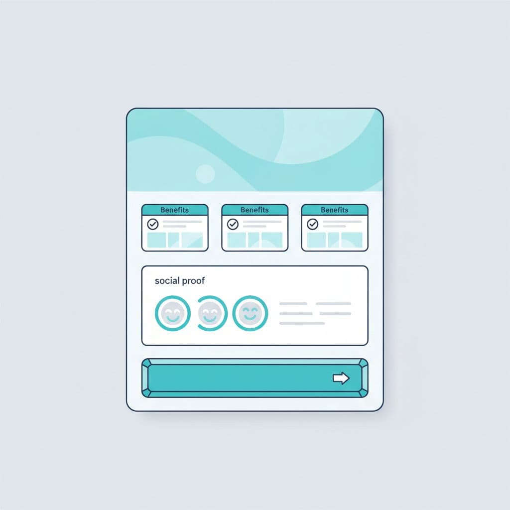
Add proof that removes doubt and builds trust
Trust signals and social proof are often the difference between a casual visitor and a qualified lead. Buyers do not need hype here, they need evidence they can scan quickly.
Use client testimonials and case studies to show real results
Specific proof beats generic praise every time. A review saying “they were great to work with” is weak, but a statement noting how you cut wasted spend by 28 percent in 90 days while improving lead quality is far stronger because it provides necessary context.
Match your client testimonials and case studies to the specific audience on the page. If the page targets CMOs at mid-market firms, showcase results from buyers with similar roles, budgets, or growth goals. A short summary works best for these assets; include the challenge, the fix, and the result in just a few concise lines.
Add trust indicators that reduce hesitation fast
Effective trust indicators include recognizable client logos, high review counts, years in business, industry certifications, awards, and clear service guarantees. Be careful not to crowd the page with too many badges, as an excess of visual elements can look decorative and actually undermine your credibility.
Use evidence that addresses specific buyer hesitations. If potential customers worry about risk, highlight your proven process. If they worry about fit, clearly explain who the service is best for. If they are concerned about performance, showcase hard metrics and real world examples. While a simple proof strip near the top of the page can establish immediate credibility, deeper social proof should sit near the middle, where interest is high and doubt begins to rise.
Make the page easy to scan and easy to act on
Even strong copy fails when the page is hard to read. Most buyers scan first, so the structure must carry meaning even before they read every sentence. By improving your website navigation and layout, you ensure that potential clients can find the information they need without feeling overwhelmed.
Break complex services into simple steps
A short process section lowers anxiety because it explains exactly what happens after the user completes a contact form. Keep it to three to five steps.
For example:
- Start with an audit or discovery call.
- Define the offer, audience, and conversion goal.
- Build or revise the page.
- Launch, test, and improve weak points.
That sequence helps the buyer picture progress, and it makes the service feel more tangible.
Strategic call to action placement
Put the main call to action near the top, again after the solution or proof section, and once more near the end. That repetition helps because visitors decide at different moments throughout their journey.
Use one primary action and, if needed, one softer secondary call to action. A page that asks people to call, chat, download, subscribe, and browse case studies at once usually weakens lead flow.
Use frequently asked questions to remove objections before they block the lead
Good frequently asked questions answer real buyer concerns, such as cost, timeline, scope, fit, reporting, and expected results. Keep answers short and direct.
This section also helps search visibility because it adds clear, extractable language around buyer questions. If you are troubleshooting a page that gets traffic but no leads, Get a Free Consultation can help spot whether the problem is message, proof, or friction.
Common service page mistakes that kill conversions
The worst mistakes are usually simple. Weak headlines, vague copy, missing proof, too many CTAs, long text blocks, and pages that try to sell everything at once all make action harder, which ultimately drags down your conversion rate.
A common example is a headline like “We help businesses grow.” That line says almost nothing. A visitor still does not know the service, the audience, or the outcome.
Another problem is poor user experience caused by visual clutter. If every section has sliders, badges, popups, and competing buttons, the page feels busy instead of trustworthy. These elements distract from your sales funnel, making it difficult for prospects to identify the next logical step in their journey.
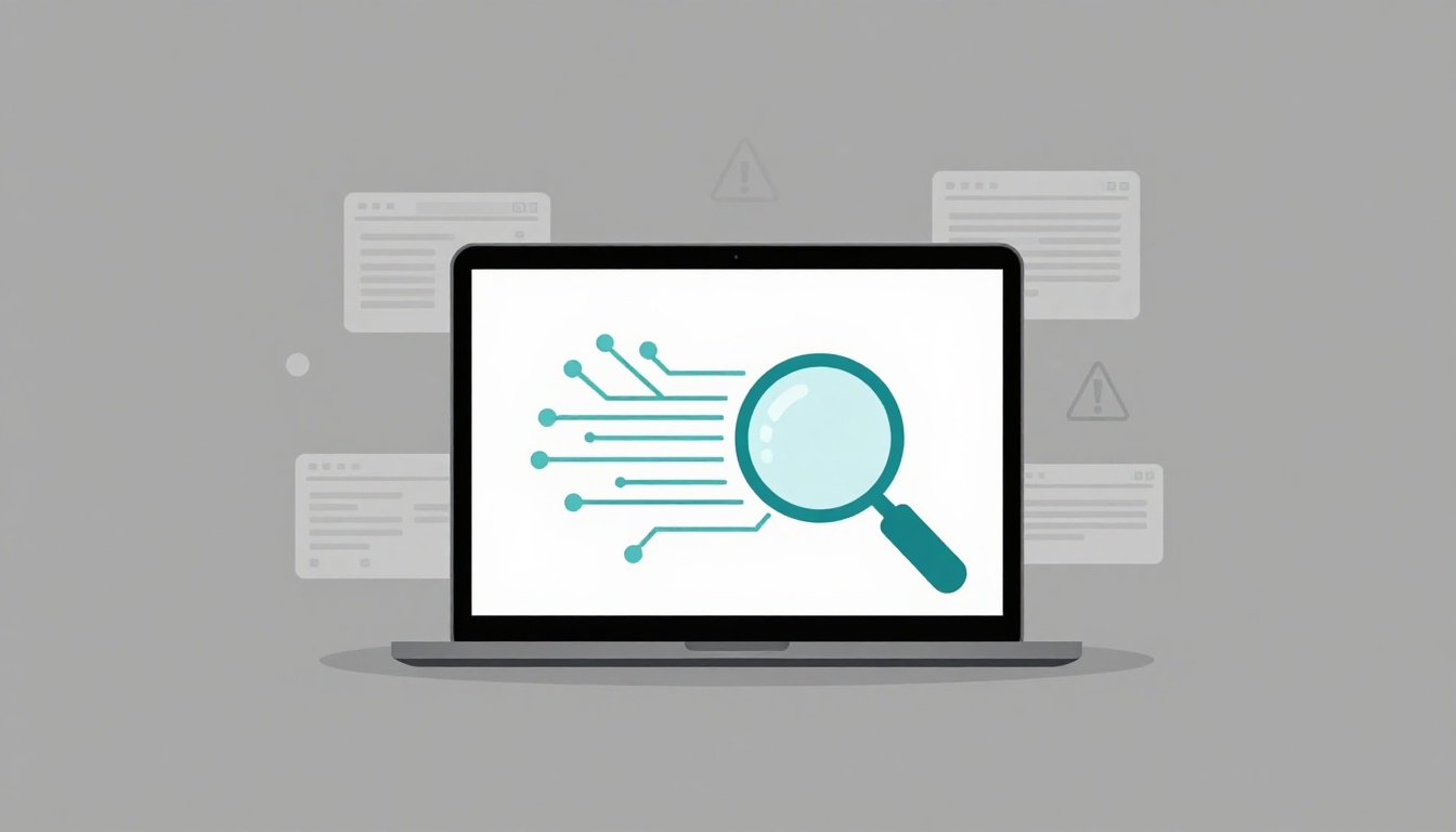
What to fix first if your page is getting traffic but no leads
Start with the message before you blame the traffic source. Work through the page in this order:
- Rewrite the headline so it states the service, audience, and result.
- Check the CTA to ensure it is specific, visible, and optimized for mobile-friendly design.
- Add proof that matches the type of buyer you want to attract.
- Cut vague copy and break dense text into short, scannable sections.
- Reduce form friction by asking for less information or offering a low-commitment lead magnet for visitors who are not yet ready to buy.
That order catches the biggest issues first. In many cases, small structural edits and refinements to your user experience lift response more effectively than a full redesign.
Conclusion
A service page is not just decoration. It is a strategic decision path.
The pages that drive the most leads are usually the simplest ones. They answer the buyer’s questions quickly, prove that your service offerings are credible, and make the next step effortless. By prioritizing a logical service page structure, you create a better experience for your visitors while simultaneously improving your search engine optimization.
If your current page feels polished but underperforms, focus on fixing the structure before you change the design. Start with clarity, add proof where doubt is highest, and ensure your call to action remains obvious. When you align your content with how customers make decisions, you turn your website into a powerful lead generation tool.
FAQ
What is the best structure for a service page?
The best structure includes a compelling headline, a section addressing client pain points, a clear explanation of your service offerings, and trust indicators. Following this with proof and a contact form helps guide the user toward a decision while improving your overall conversion rate.
Should each service have its own page?
Yes, in most cases. Utilizing individual service pages makes it easier to match specific search intent, tailor your messaging, and maintain clean website navigation. This approach ensures your call to action stays focused on a single offer, which typically leads to better results.
How long should a service page be?
There is no single ideal length. Your page should be long enough to detail your service offerings, build trust, and address objections, but concise enough to remain scannable. Prioritize quality over quantity to ensure users can quickly find the information they need to move forward.
Where should the call to action go on a service page?
Your primary call to action should appear near the top, again after the core value proposition, and once more near the bottom. By repeating the same primary call to action, you remove friction and ensure users can convert whenever they feel ready to engage.
Do FAQs help service pages rank and convert?
Yes, frequently asked questions are highly effective. They allow you to integrate social proof, such as client testimonials or mentions of past case studies, while providing search engine optimization benefits. By incorporating relevant keywords into your frequently asked questions, you can improve your visibility in organic search results. Furthermore, optimizing your url structure and writing a descriptive meta description for these sections helps search engines categorize your content. Finally, using internal links to connect your FAQ section to other parts of your site keeps users engaged and supports a more robust ranking strategy.